How Not to Fail at Home Design: The Lies of Unity, Openness, and Oppressiveness
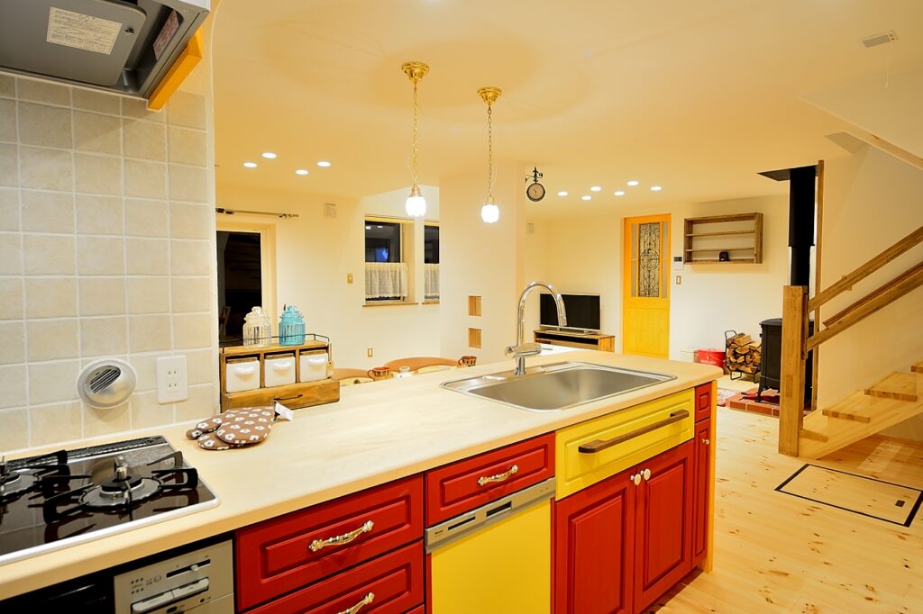
Built in 2016.
A home with a bright red kitchen.
In the world of house design, there are too many words ending with “-ness.”
Unity, openness, oppressiveness.
What’s with all this “-ness”?
Unity is an Escape from Design
Brown everywhere will certainly “hold together.” Even an amateur can pull that off.
That’s why big housing companies that can’t design, or material manufacturers who push “package deals,” sell with the word “unity.”
But life changes. People age. Eyesight weakens. A house built on color uniformity becomes boring. And soon enough, when you buy furniture, you’ll feel chained to brown again. That’s suffocating.
Good design doesn’t rely on unity.
In Europe and Asia, many good buildings or shops look colorful and uneven, yet they harmonize.
Why? Because they are unified by materials, not colors.
Wood stays wood. Stone stays stone. Earth is plaster or mortar. Iron is limited to reinforcement.
If the backbone is consistent, the wall can be deep green, the door red, the floor honey-colored—and they won’t clash.
But once you throw in vinyl, it collapses. The only material that betrays us is petroleum-based vinyl.
Adding more colors doesn’t equal more freedom. The more colors, the harder the design.
That’s why experience and skill matter.
Trust the material. Play with color. That’s my stance.
Openness is an Illusion
“Openness” is another magic word.
A grand chandelier hanging from a double-height ceiling. Sun pouring through giant windows.
That may resonate with Western DNA. And if that makes someone feel calm, go ahead.
But the opposite is also true.
For many, a sauna-sized space feels calmer. To me, this is the real Japanese instinct.
Japan has the tradition of the tea room.
You bow through the small entrance, sit under a low ceiling, and focus on the subtleties of light, scent, and conversation.
Even as children, we made secret bases in closets—same DNA.
In short: “Japanese DNA = Tea Room Culture.”
That’s why I set my ceilings low: 2.2m on the first floor, 2.1m on the second.
On paper it may look low, but live in it and it feels right.
Heating and cooling efficiency improves, earthquake resistance strengthens with a lower center of gravity, and repair areas are reduced.
Calm, energy-efficient, sturdy, and easy to maintain. Logic and instinct both align.
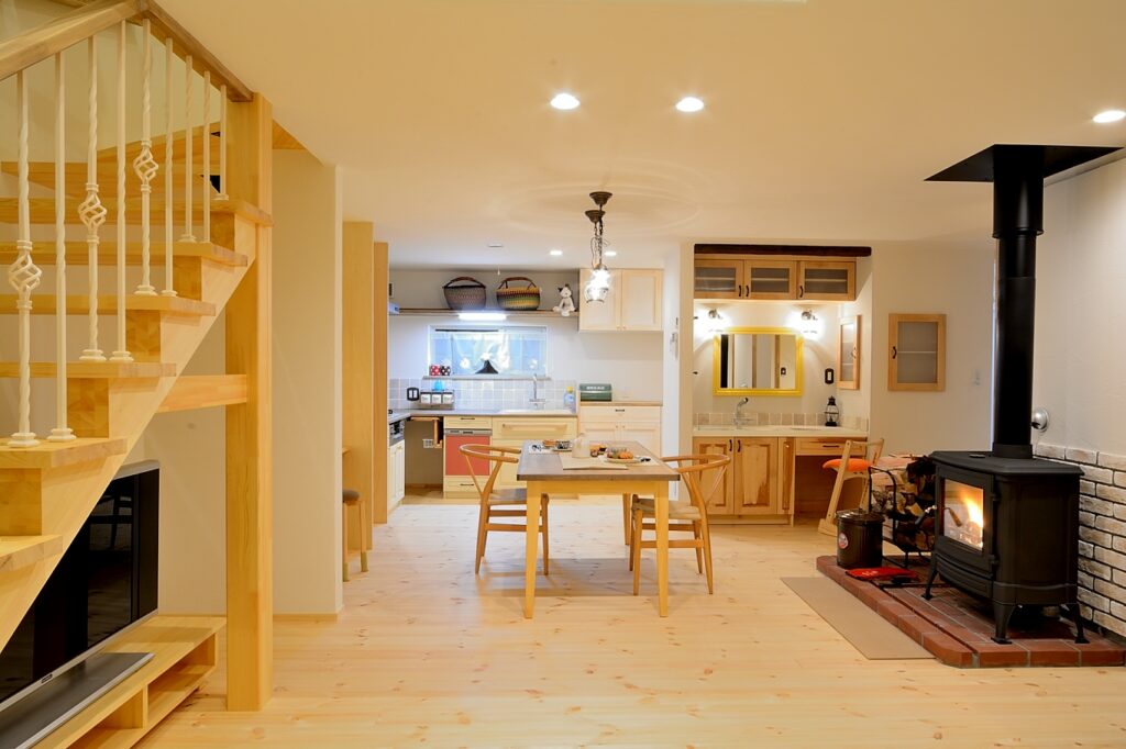
Built in 2015.
A home with a washbasin in the living room.
Oppressiveness is Brainwashing
People often say, “It feels oppressive…”
But humans spend far more time sitting or lying down than standing. From that perspective, a 2.2m ceiling makes perfect sense.
“Oppressiveness” is half brainwashing.
At open houses, people never noticed the ceiling until I mentioned “ours is lower than others.” Suddenly they bent their knees and muttered, “Feels oppressive…” That’s when I knew they weren’t my people.
Humans aren’t horses—we don’t live standing up.
In reality, once you live in such a home, the so-called oppressiveness disappears and calmness takes over.
Many of my homeowners have told me they actually feel uneasy when visiting grand open houses with huge voids and chandeliers. That says it all.
My Conclusion
Unity. Openness. Oppressiveness.
Designs that rely on these “-ness” words end up binding people and deceiving them.
What you can trust instead: the honesty of materials, and the essence of human perception.
Trends will pass. Colors and shapes will change.
“The only thing that never changes is the honesty of the material.”